People Group
Recruitment Leaders Project
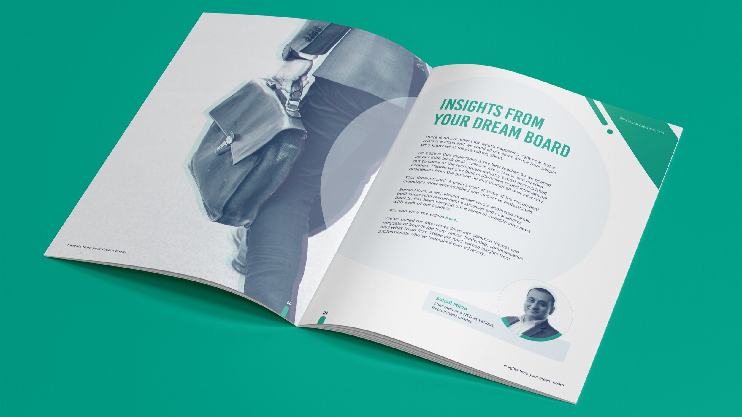
Another component of the People Group brand was the print design. We developed a print style to sit alongside the digital aspect of the brand. One of the challenges I faced was being limited to CMYK colours. I got around this by focusing on the contrast of certain elements in order to make them stand out. Using plenty of white space to balance the strong colours and applying a filter to the images in order to get a consistent look.
The document shown here is one i’m particularly proud of.